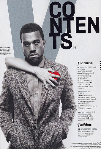
This contents page is from Vibe and is very different to the other contents pages. It however does have some similarities with Clash for example the picture of an artist with the feature that its linked to next to it with the relevant page number. The colours of the contents pages are simple using only 4. Grey, Blue, Black and a strong, bright red are used to break through the monotony. This is very effective to show the emotions of the model used. The fonts used are different between the heading and points. The heading is more elaborate and with a lot of accenting and the points are smart and formal. This suits the rest of the magazine from cover to double page spread. The contents are separated into vertical columns which are in chronological order. The heading that I can see are- Features and Fashion. There is not much more to say about this contents page except that the word 'Contents' is broken up into 3 parts. This could be done to show the indie, stylised feeling of the magazine.
No comments:
Post a Comment